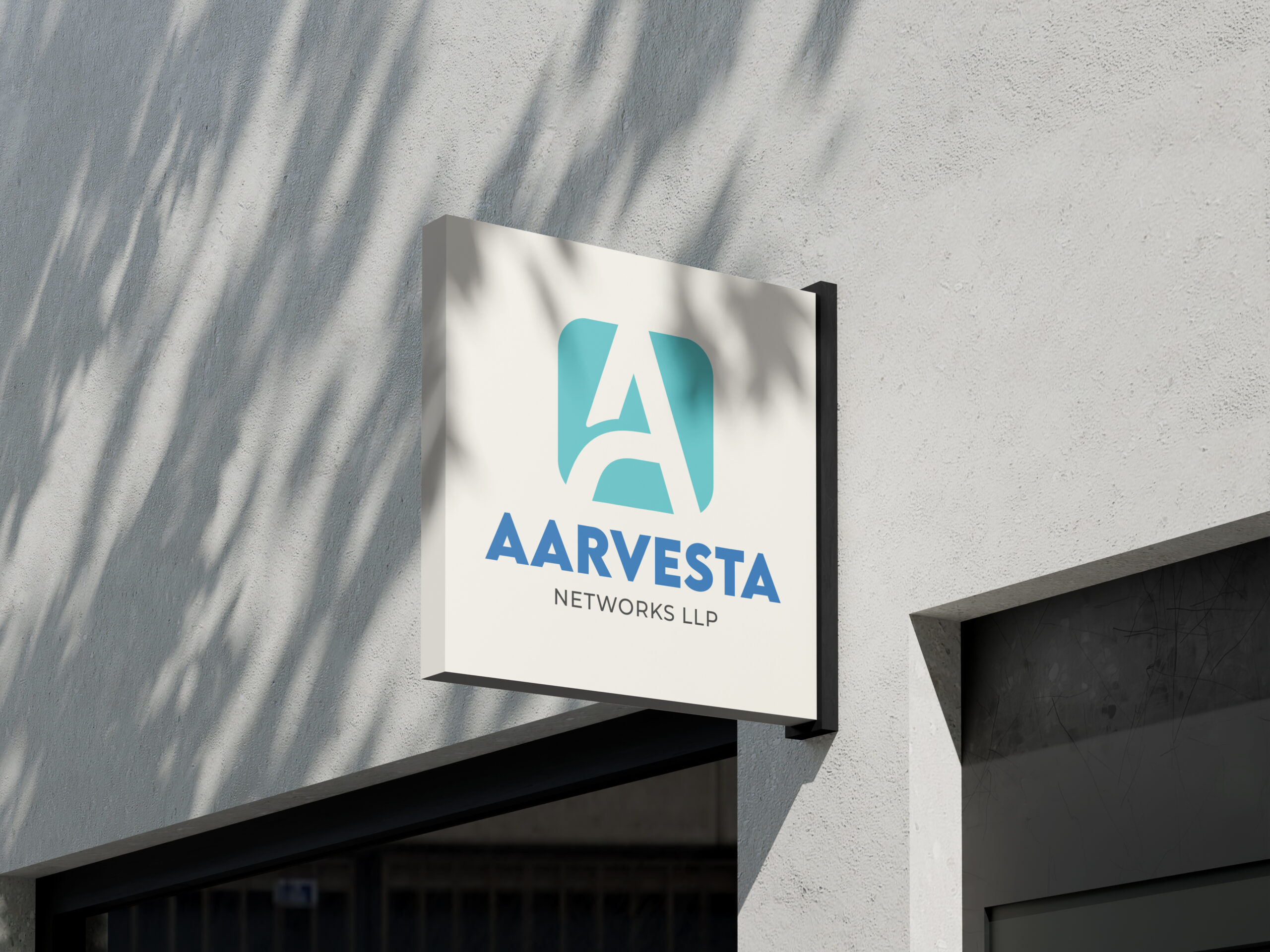
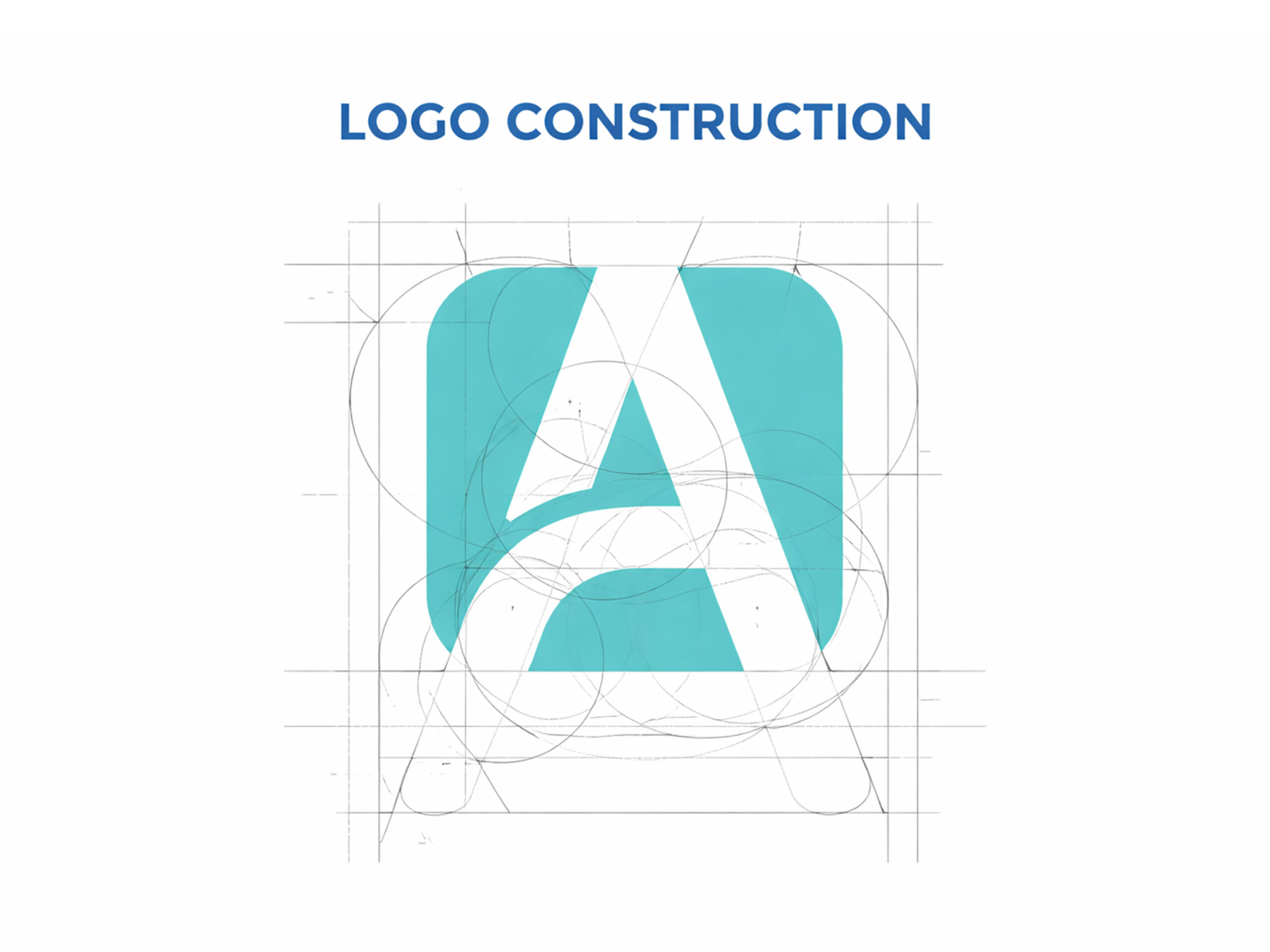
The Aarvesta Networks LLP logo is built on a foundation of precision, connectivity, and forward movement—core principles that define the company’s role in infrastructure and network solutions.
At the heart of the design is the letter “A”, symbolizing Aarvesta itself. But rather than a standard typographic form, it is carefully constructed using geometric balance and circular guides, representing engineered systems, accuracy, and reliability—qualities essential in network and ATM infrastructure services.
The curved base stroke of the “A” is not just a stylistic choice. It reflects:
- Connectivity and flow — like data moving seamlessly through networks
- Support and foundation — mirroring the company’s backend infrastructure expertise
The enclosing rounded square form signifies:
- Stability and protection — much like secure banking and ATM ecosystems
- Structured systems — representing organized, scalable network solutions
The construction grid and circular intersections ensure:
- Perfect visual harmony
- Consistent proportions across applications
- A modern, tech-driven aesthetic
The color palette reinforces the brand meaning:
- Teal/Blue tones represent technology, trust, and innovation
- The clean contrast highlights clarity and professionalism