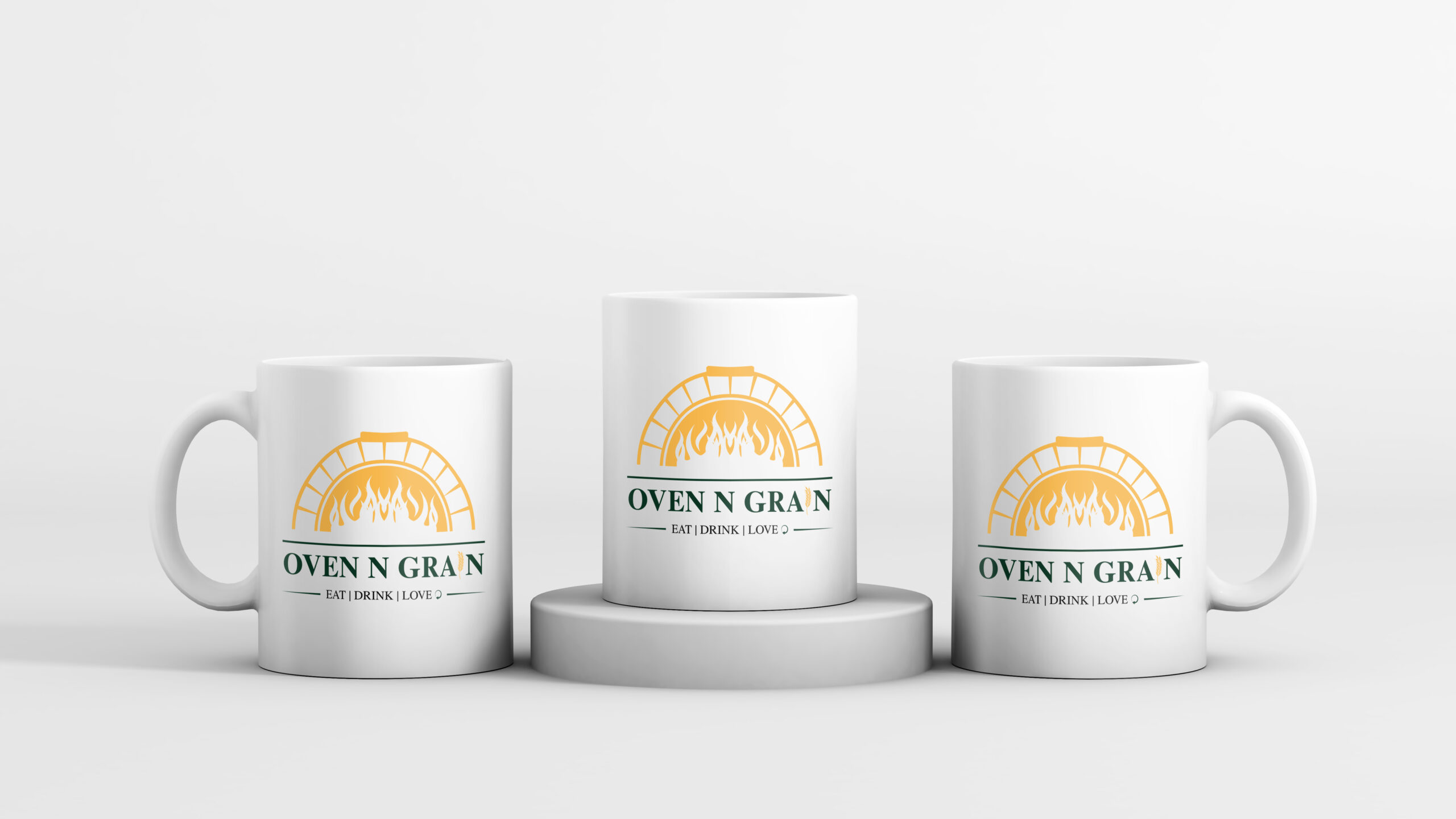
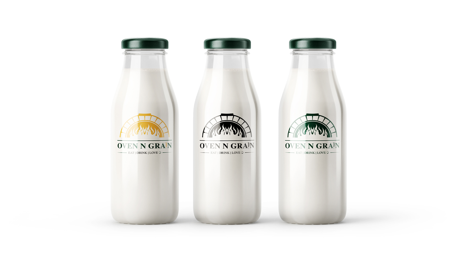
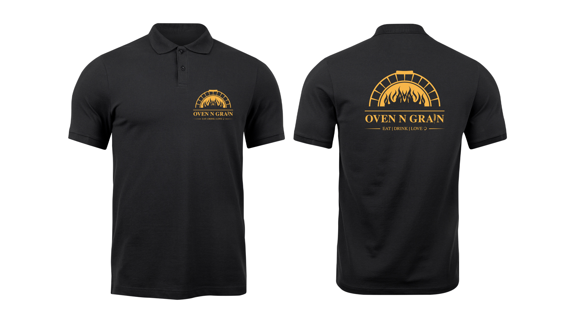
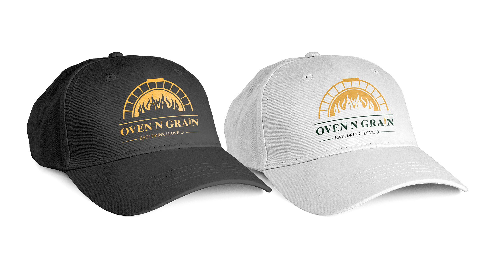
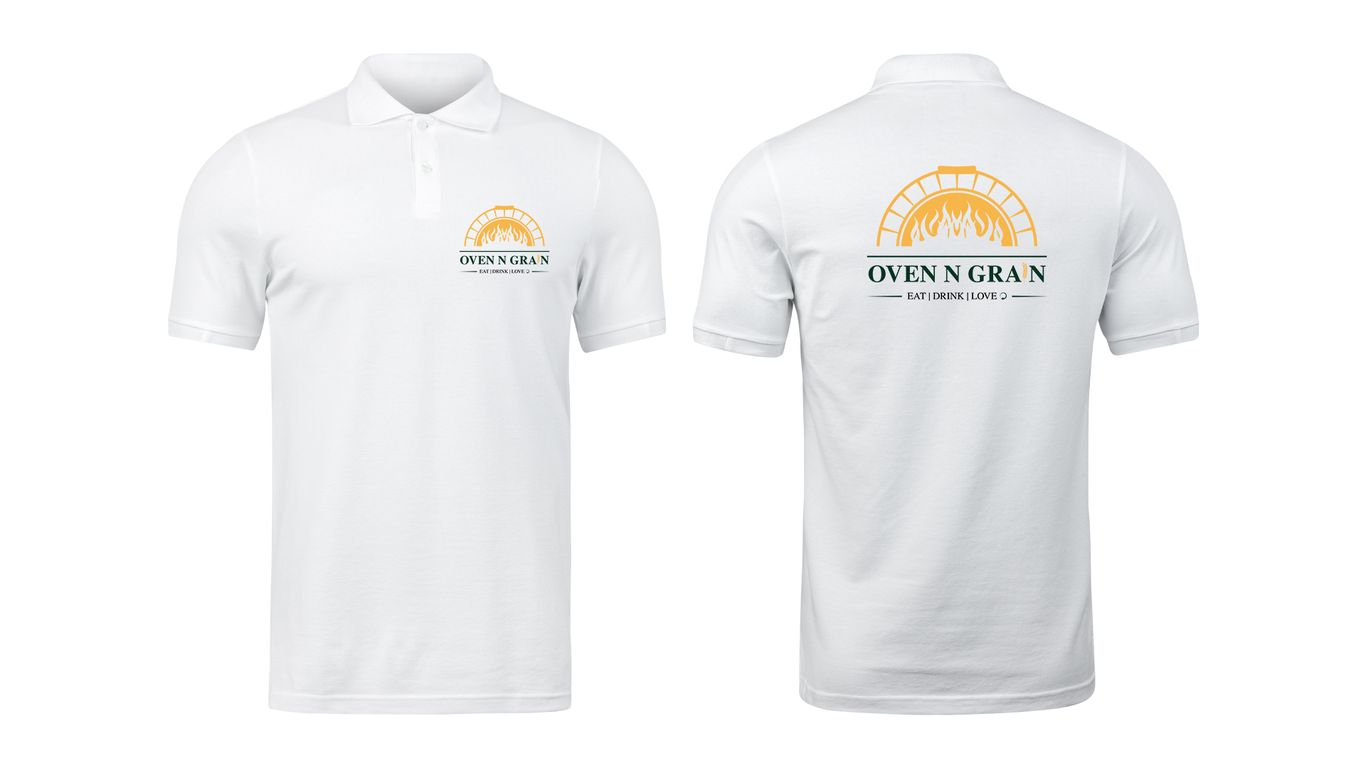
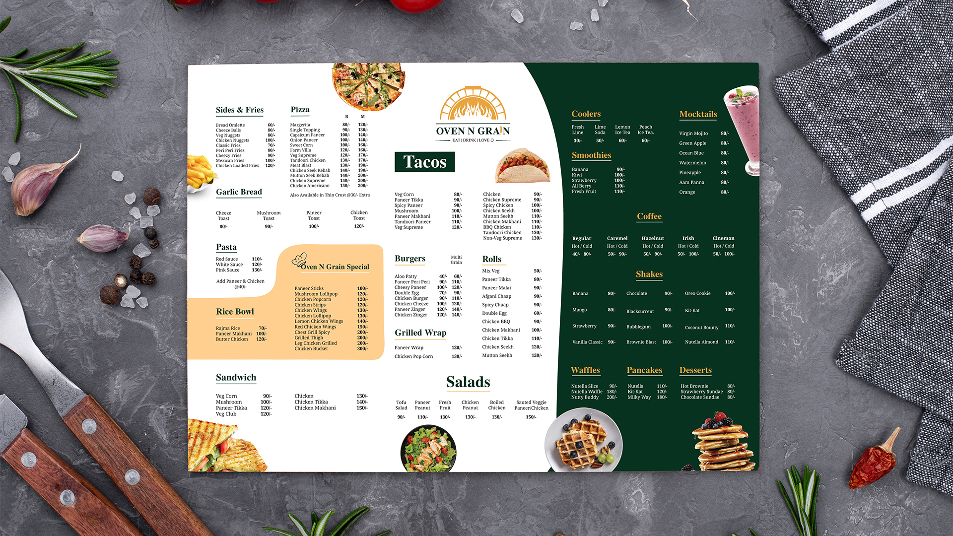
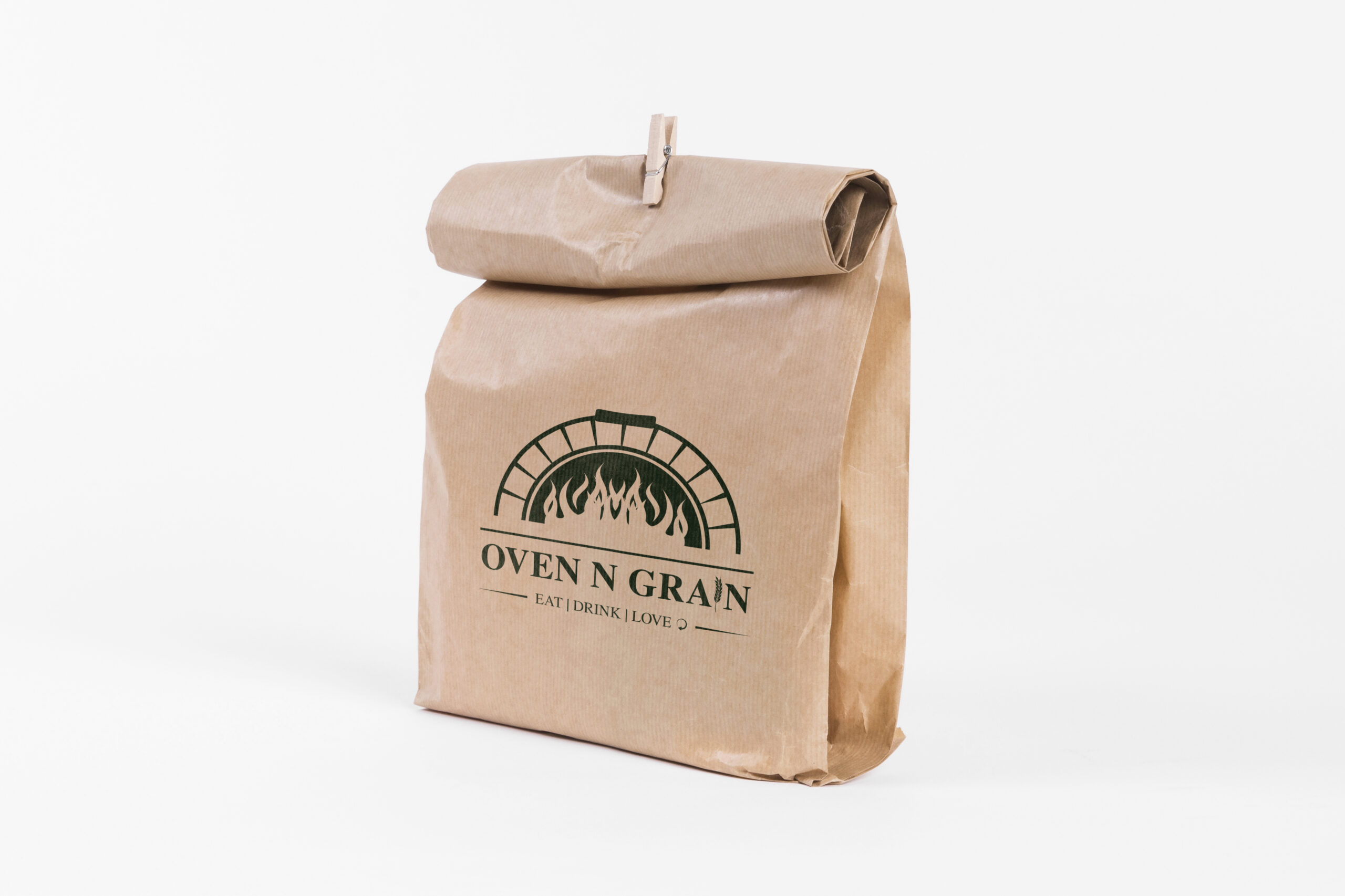
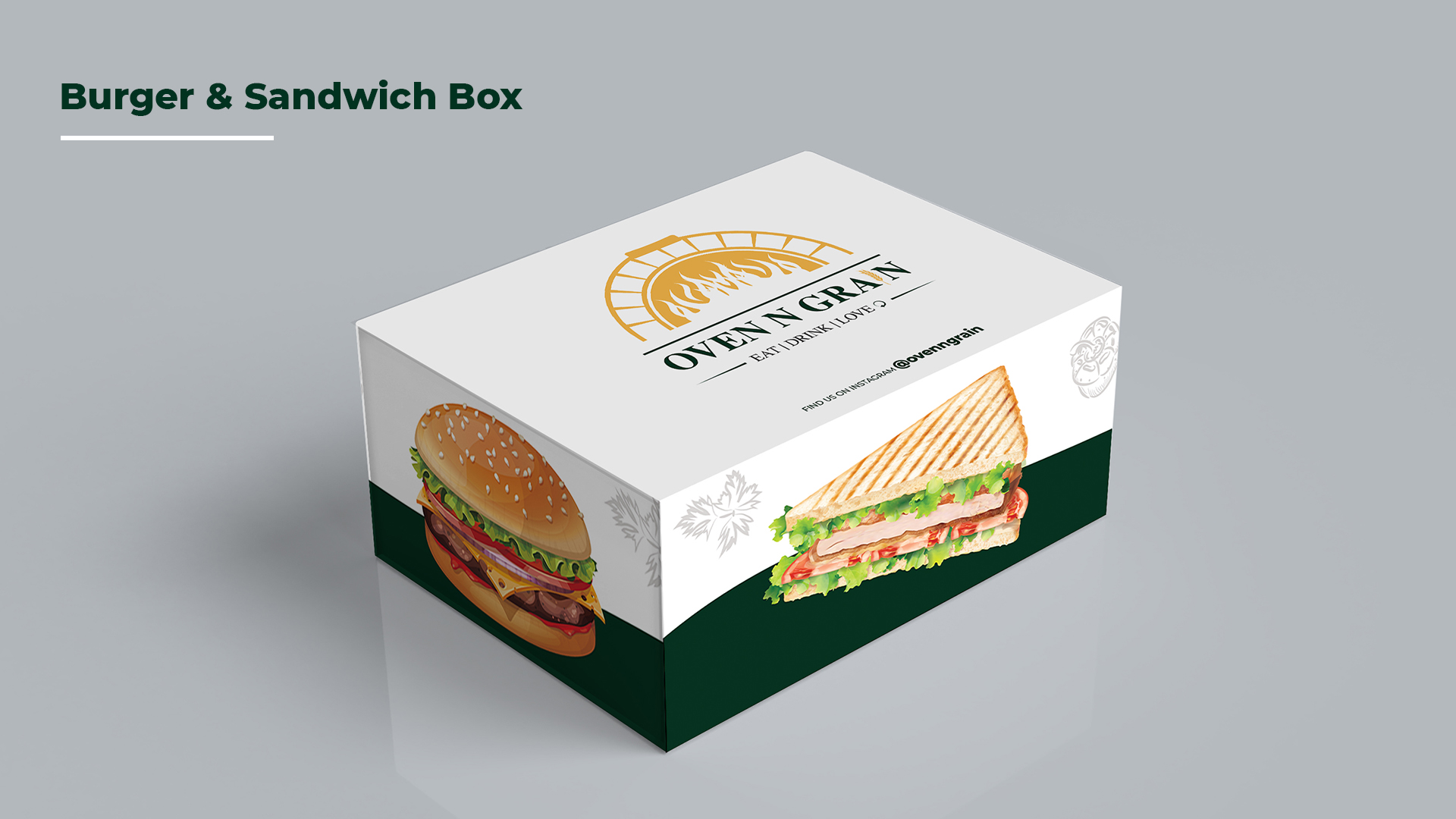
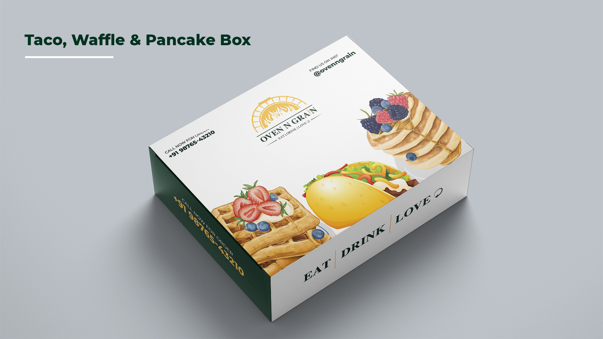
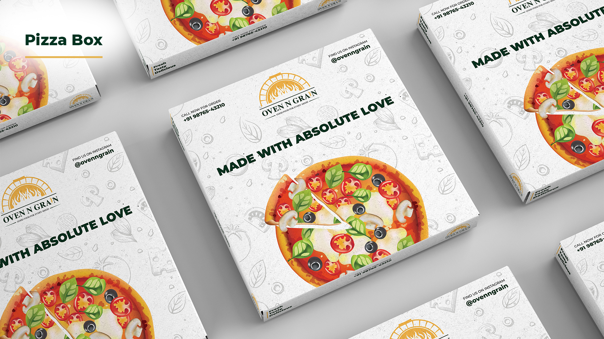
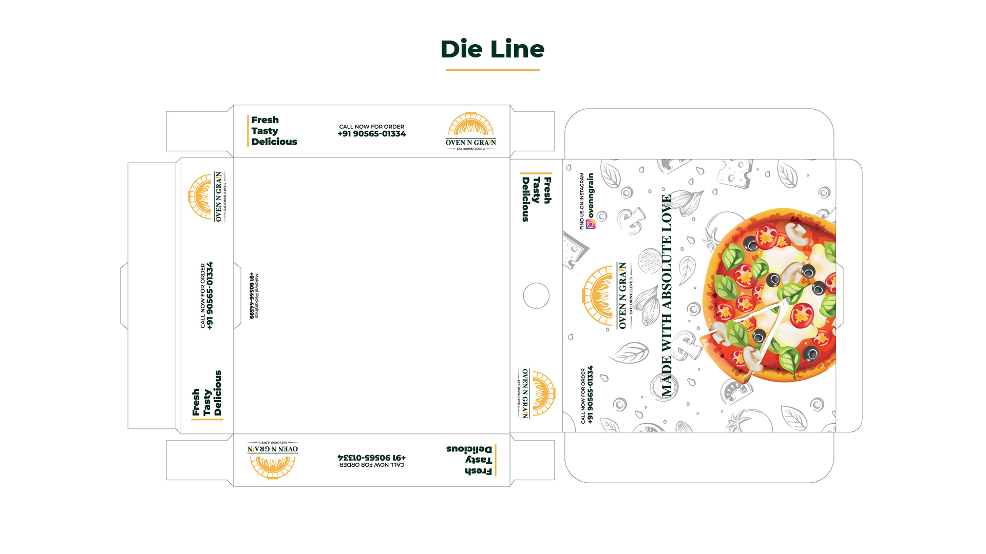
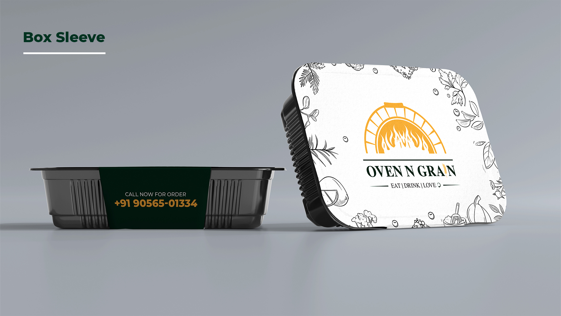
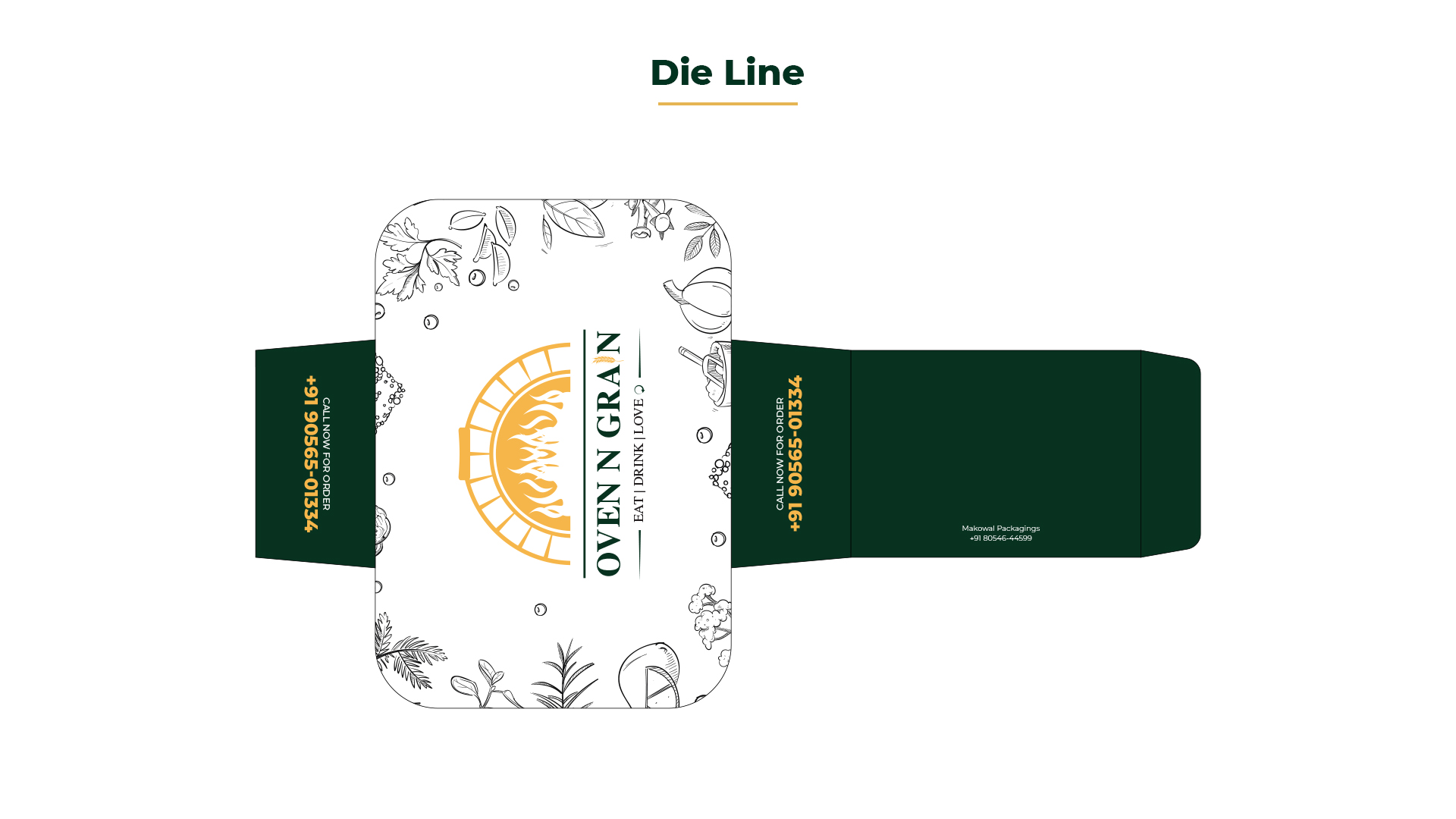
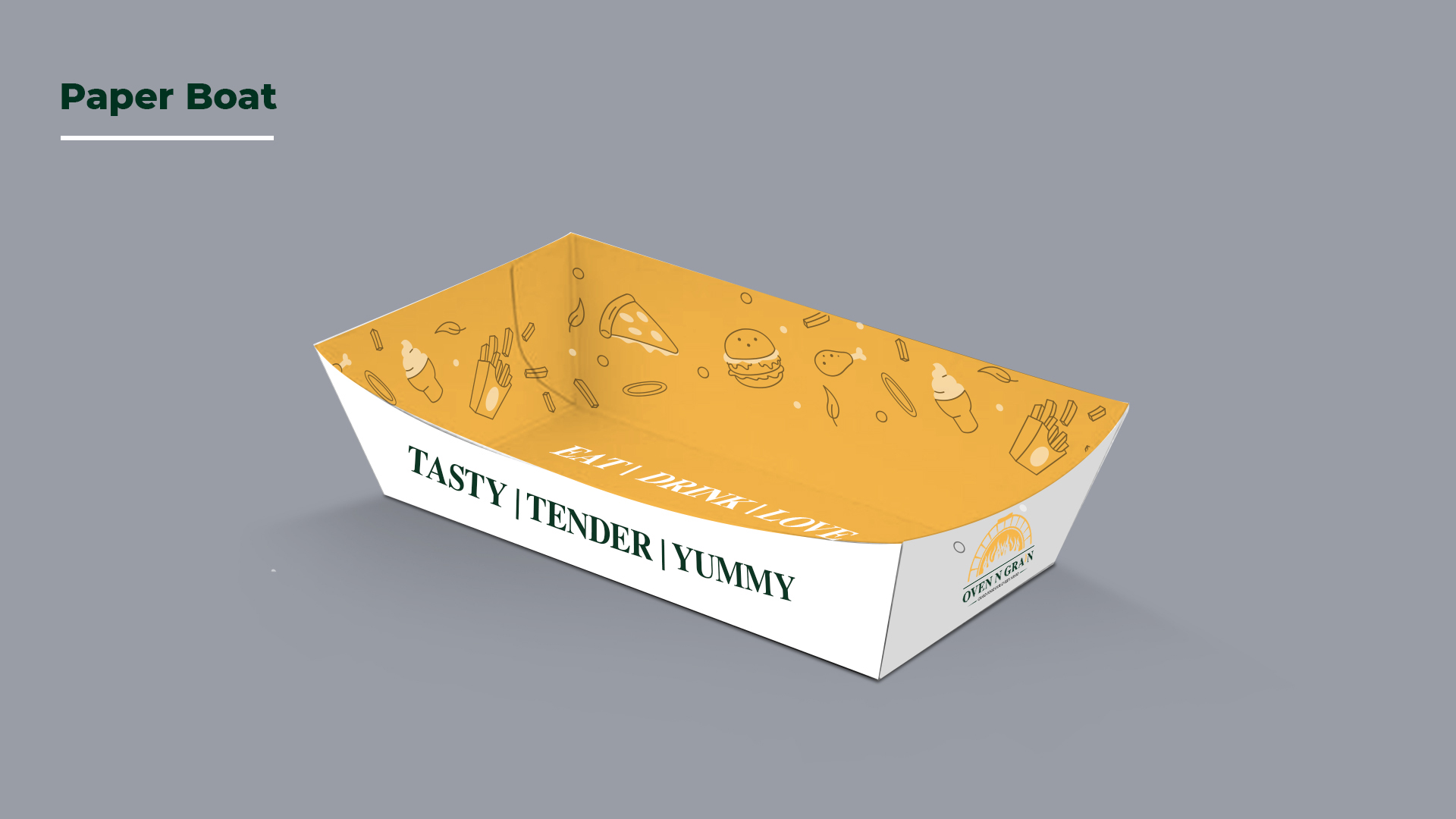
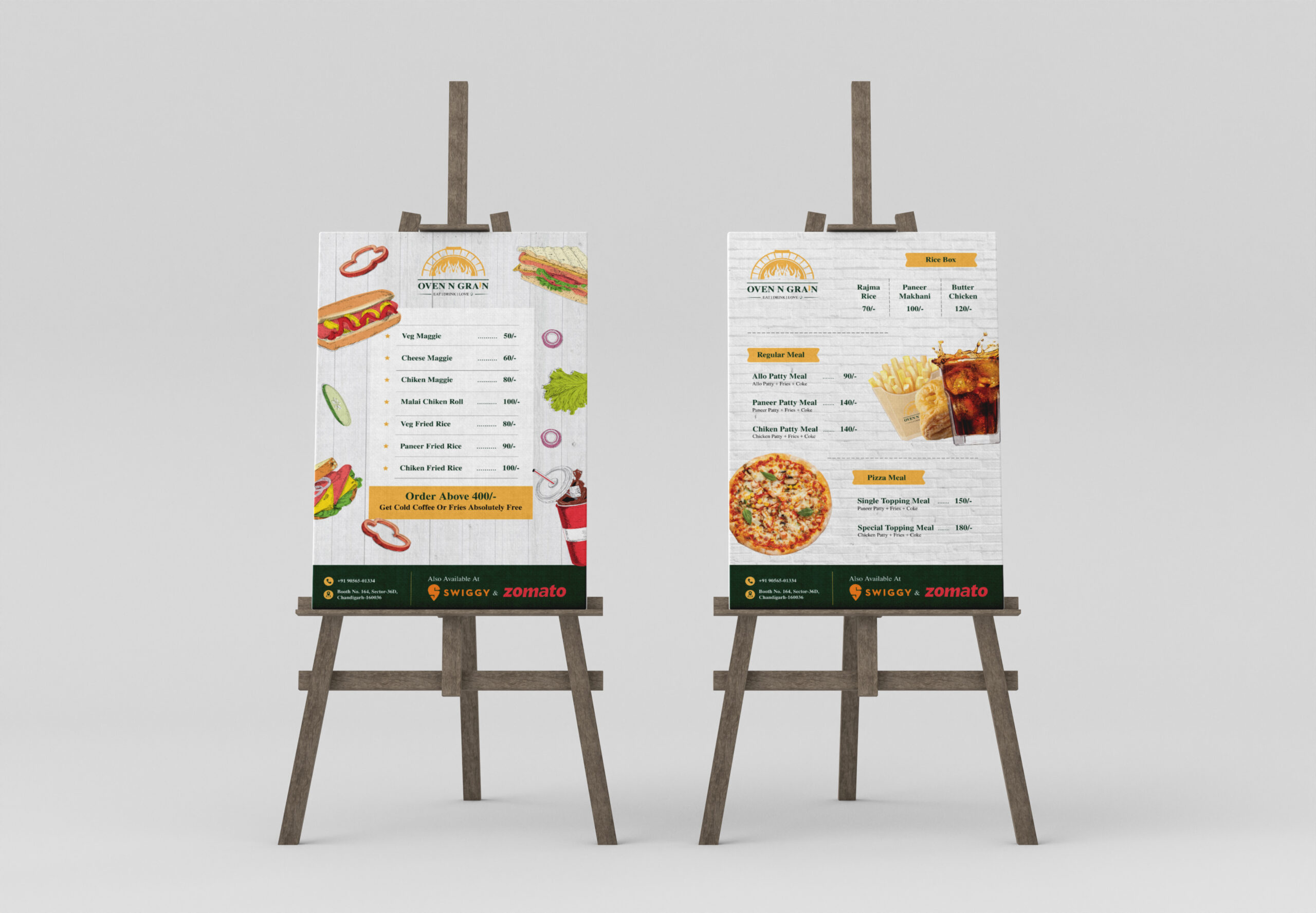
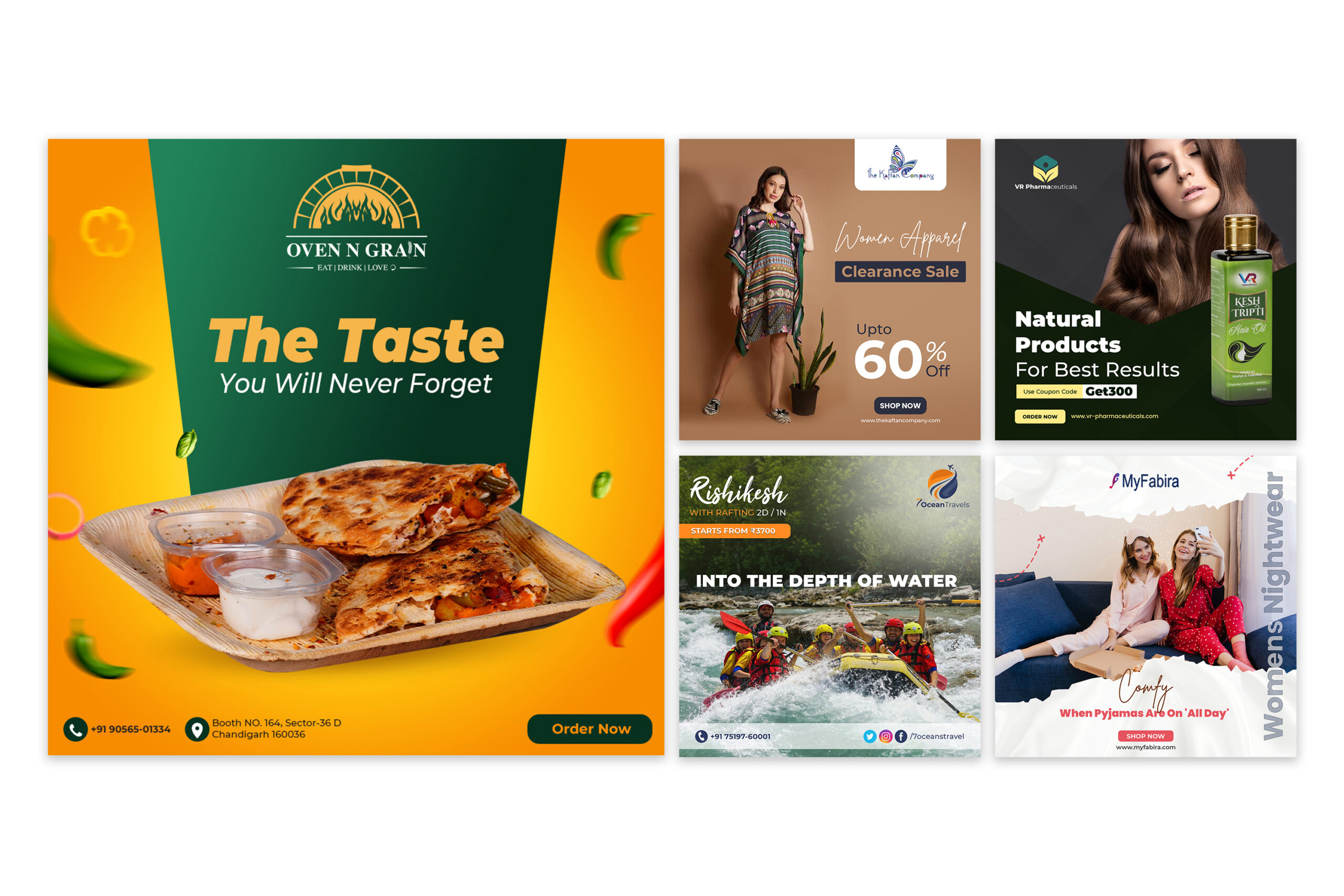
Oven N Grain is a contemporary food brand specializing in freshly baked pizzas and artisanal offerings. The objective of this project was to create a cohesive brand identity and packaging system that reflects warmth, authenticity, and a love for good food.
Objective
To design a visually appealing and memorable brand that:
- Communicates freshness and quality
- Blends modern aesthetics with traditional baking elements
- Stands out in a competitive food and delivery market
- Creates a consistent experience across packaging and brand touchpoints
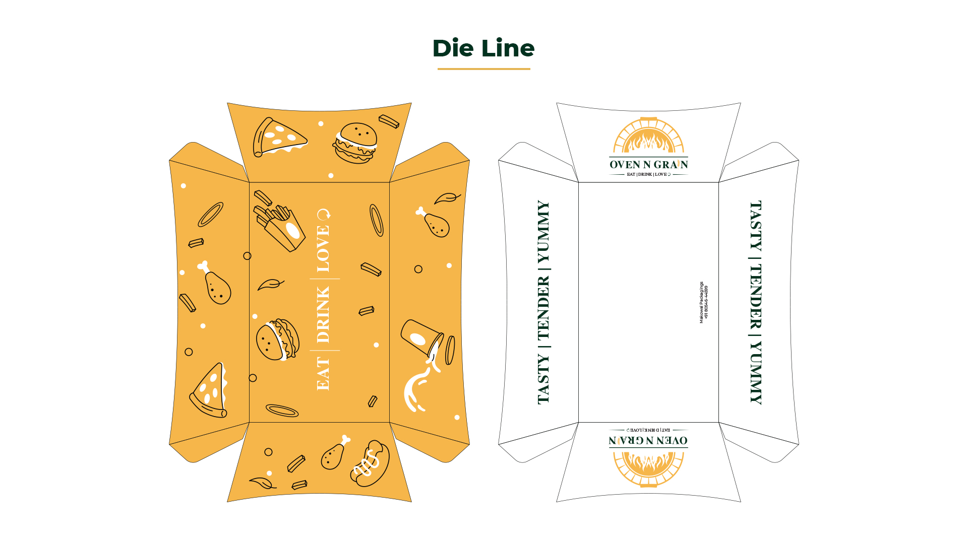
Brand Concept & Strategy
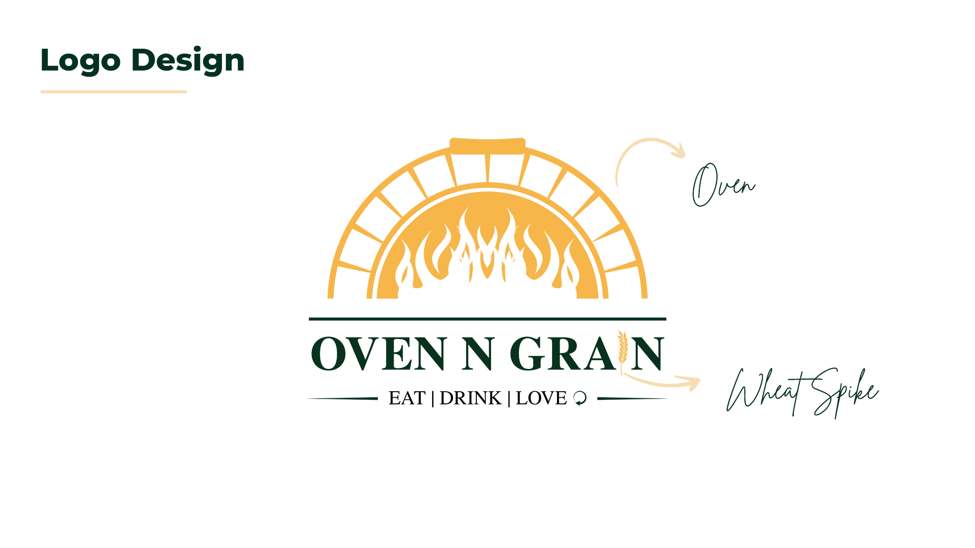
The identity revolves around the idea of “fire-crafted food made with natural ingredients.”
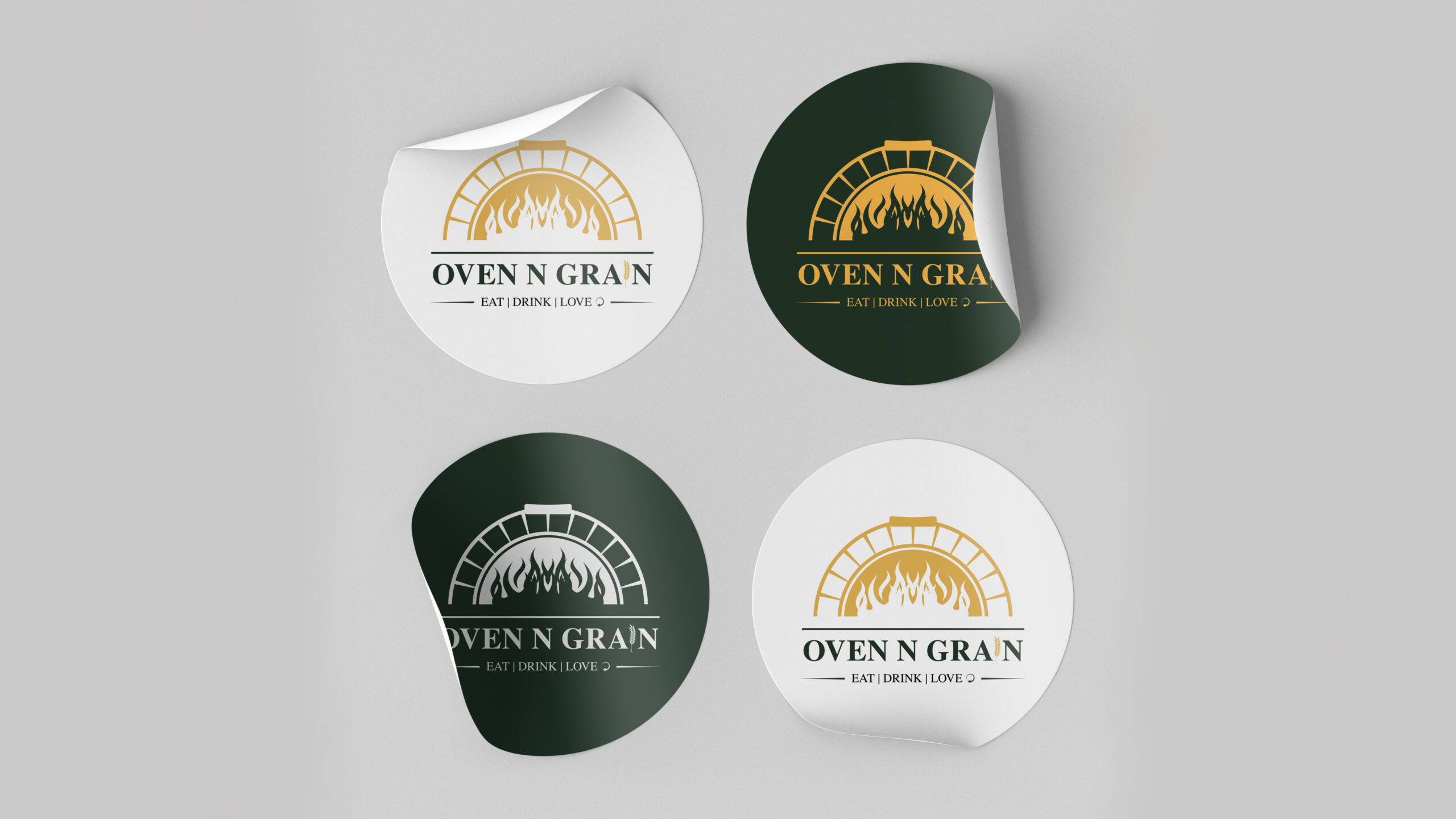
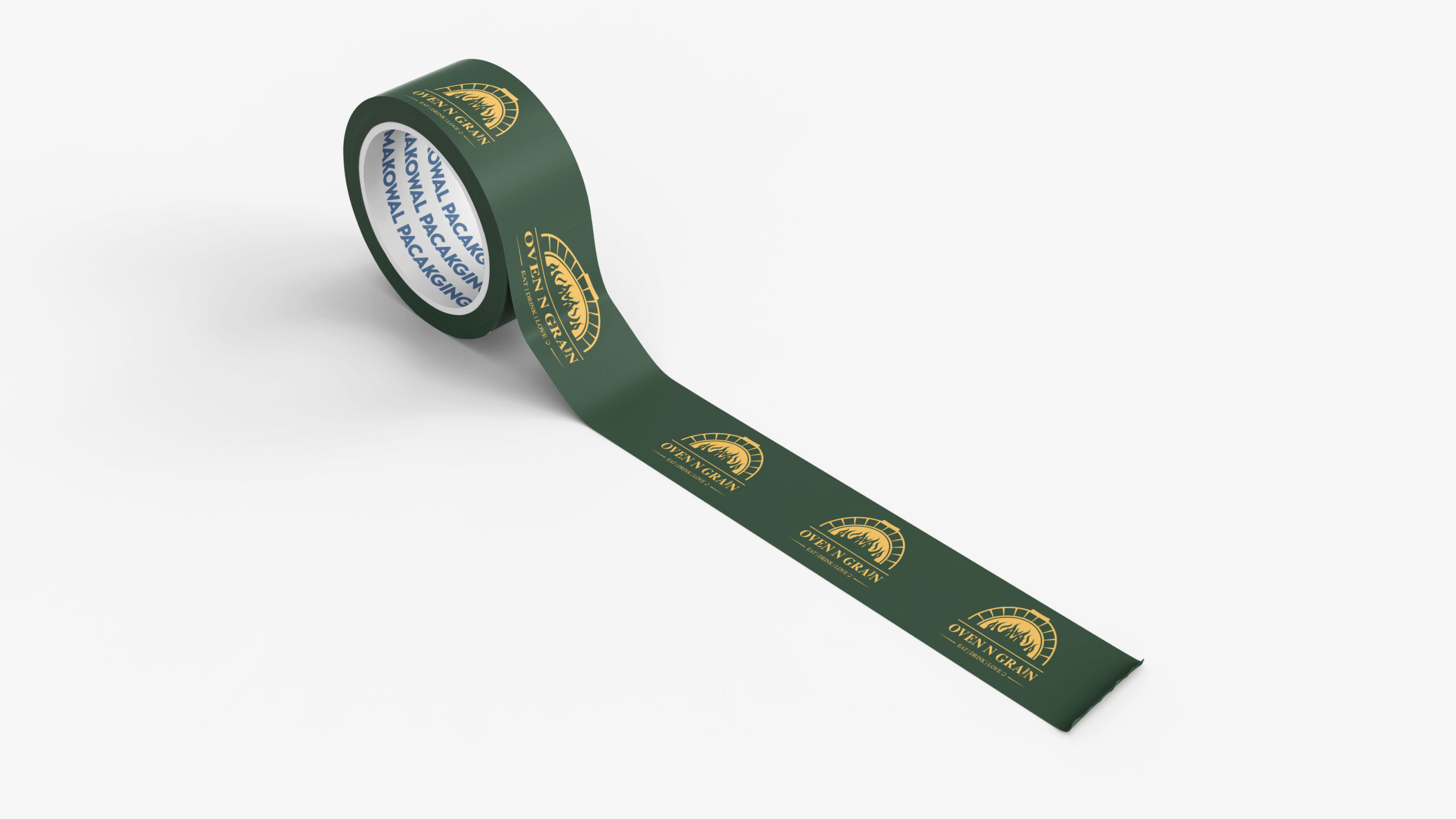
- The oven icon symbolizes authenticity, warmth, and the baking process
- The flame element represents passion and freshness
- The wheat spike subtly highlights quality ingredients and grain-based products
- A refined green and golden palette balances freshness with richness
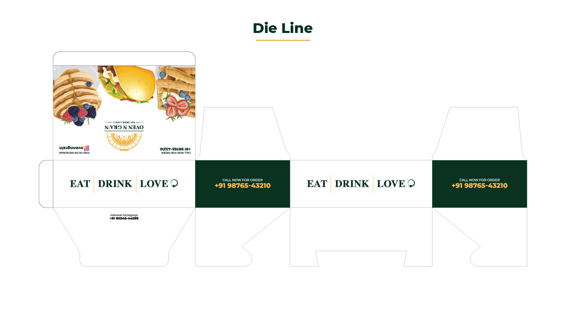
The tagline “Eat | Drink | Love” reinforces a lifestyle-oriented, emotional connection with the brand.
Design Approach
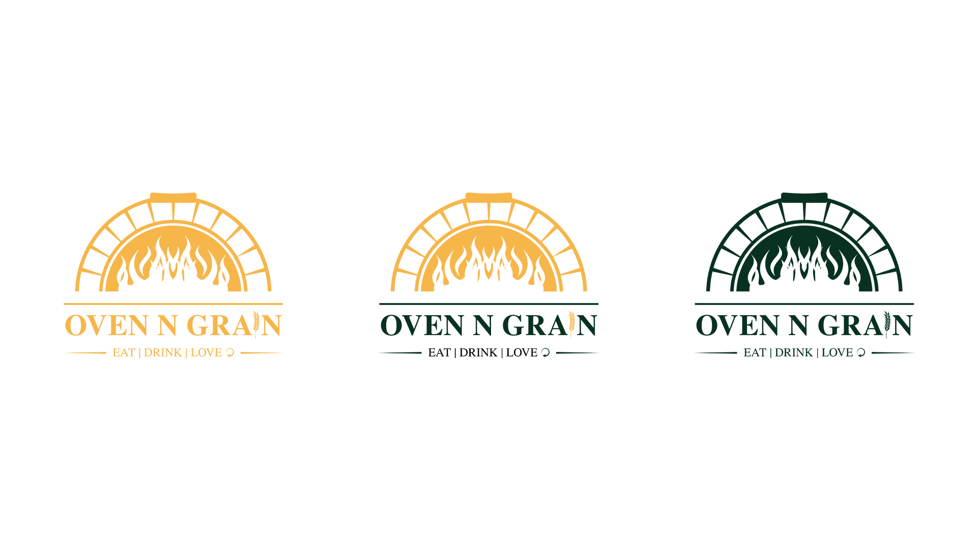
- Typography: Elegant serif typeface to evoke trust and premium quality
- Color Palette: Deep green (freshness & trust) paired with warm gold (heat & richness)
- Illustration Style: Clean, minimal yet expressive iconography
- Layout System: Balanced composition ensuring readability and brand recall